Watch Kzoom’s Professional Logo Designer Develop an Icon
How does a professional logo designer create an engaging, effective design?
If you ask a professional logo designer, they’ll tell you that a strong logo is bold, clean and deceptively simple. But, its apparent minimalism hides the fact that it requires skilled crafting, detailed intentionality, layered symbolism, and a lot of hard work to create. Designing a good logo is a multi-step process that takes many factors into consideration. To explore this creative process, we’ll follow our team’s graphic designer, Nora, as she builds a new brand identity for one of our clients, Main Street Market Maker.
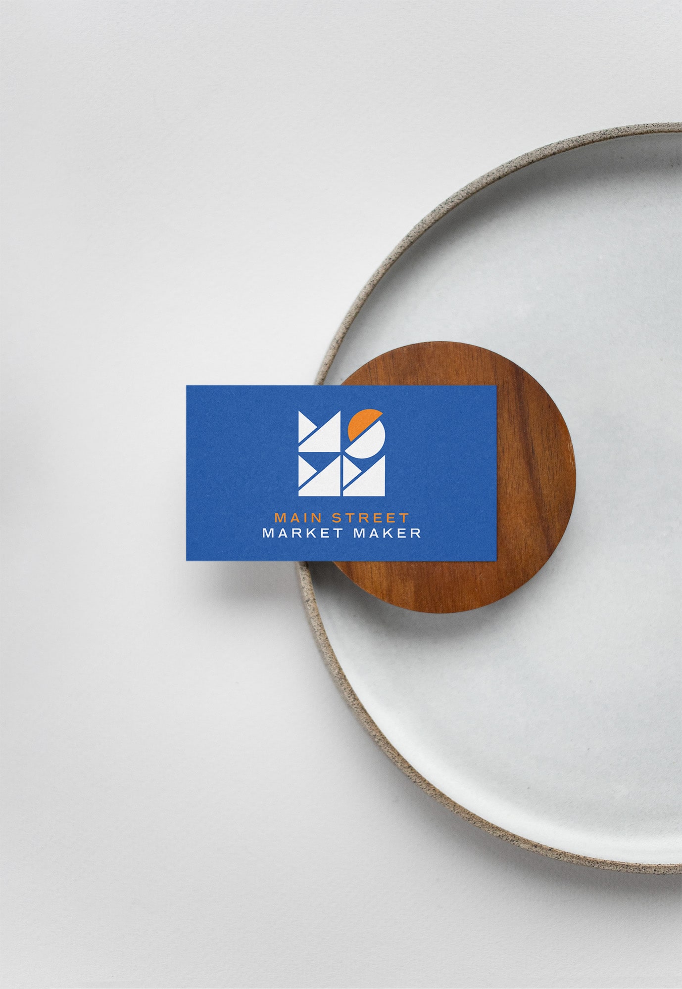
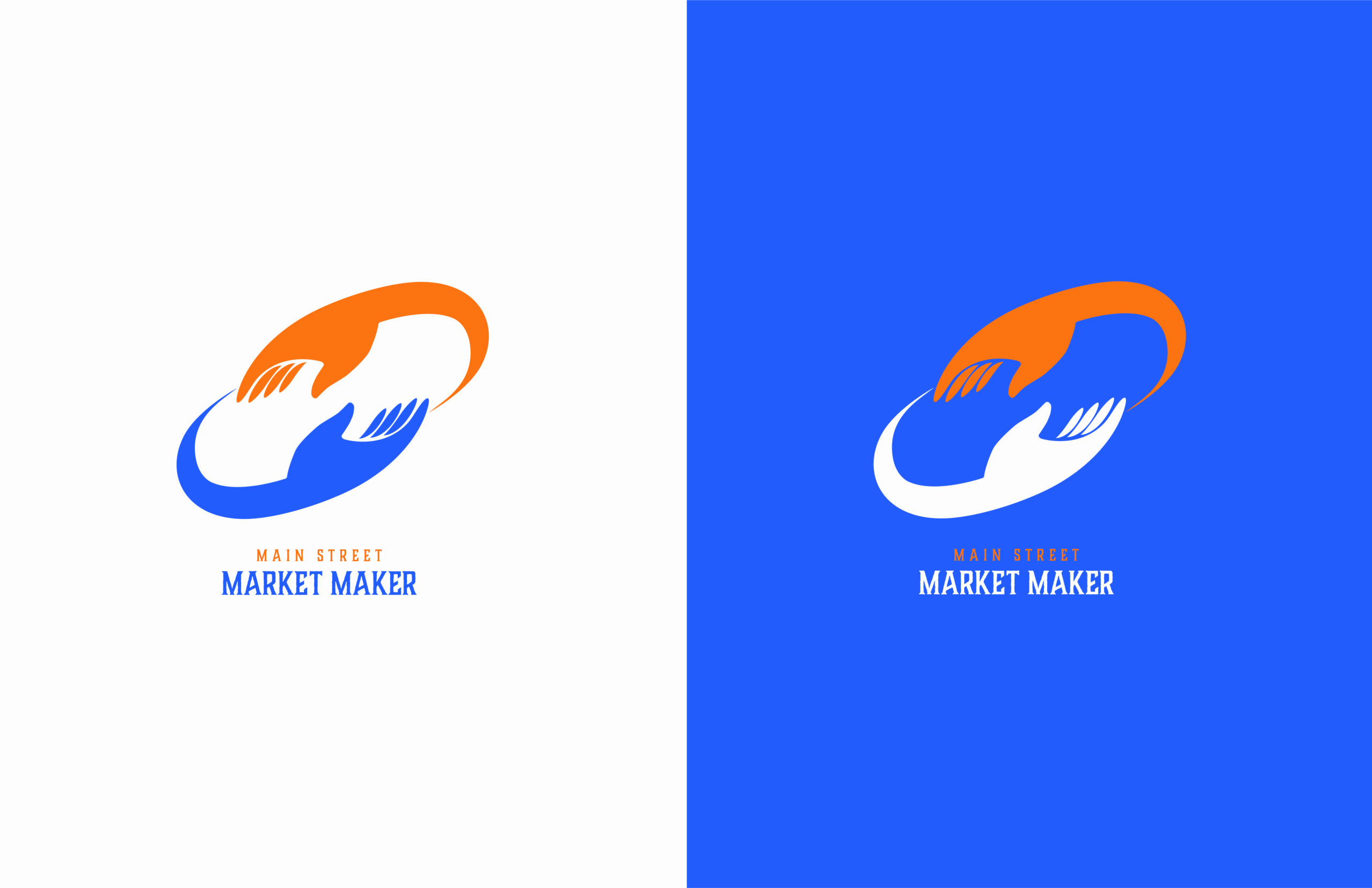
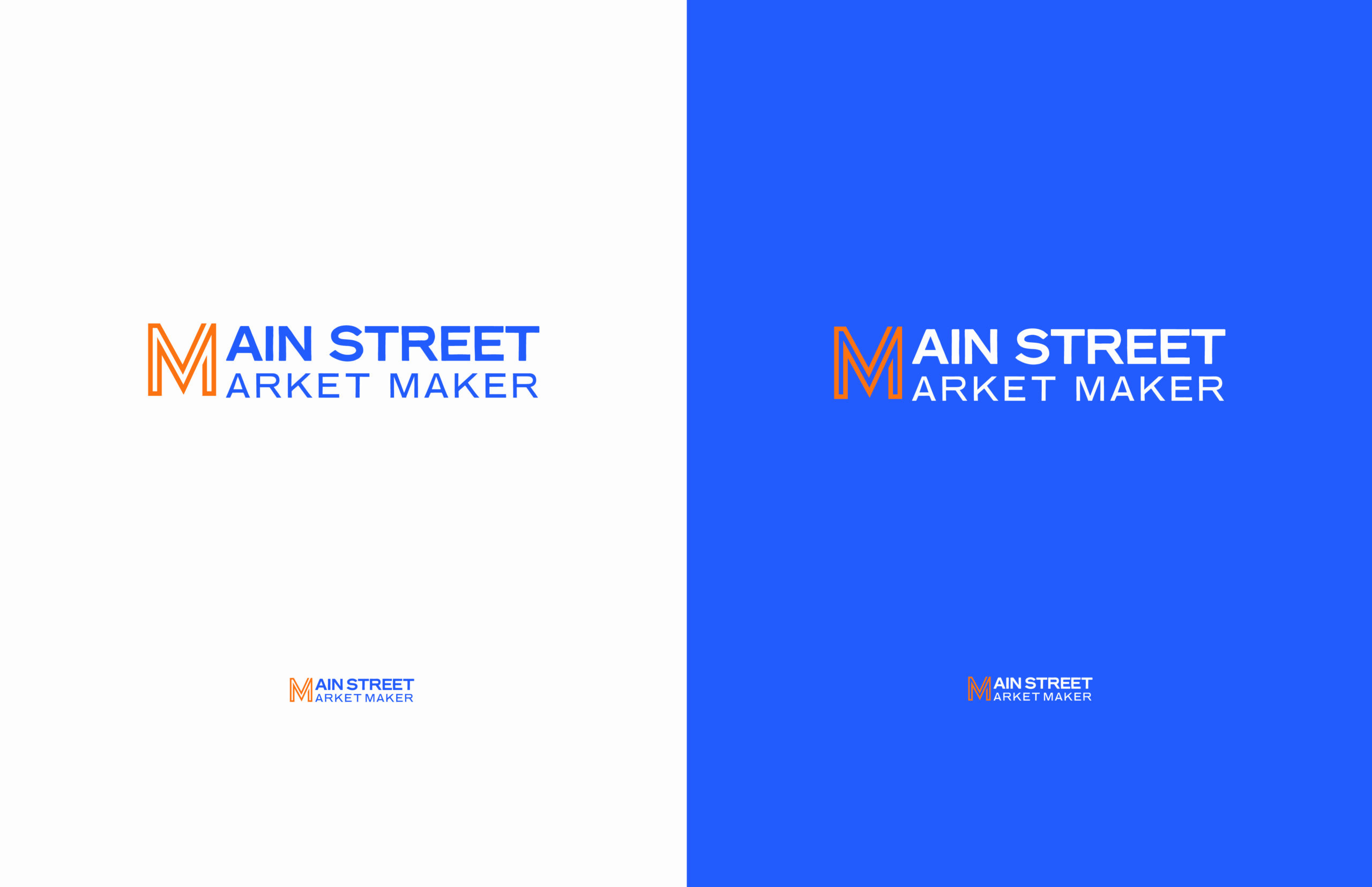
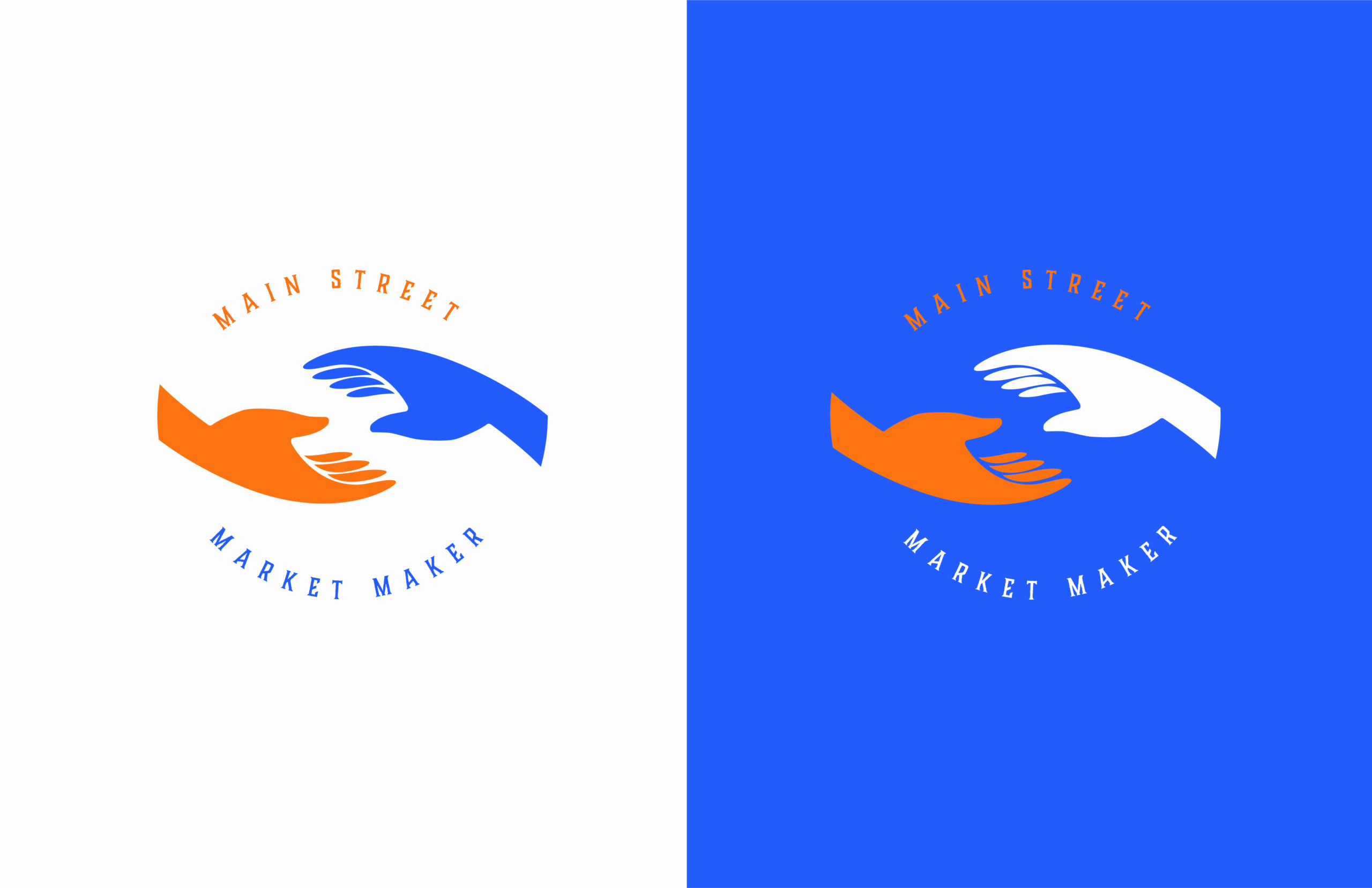
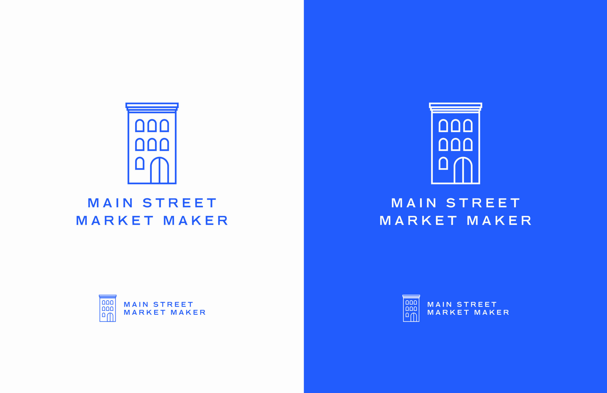
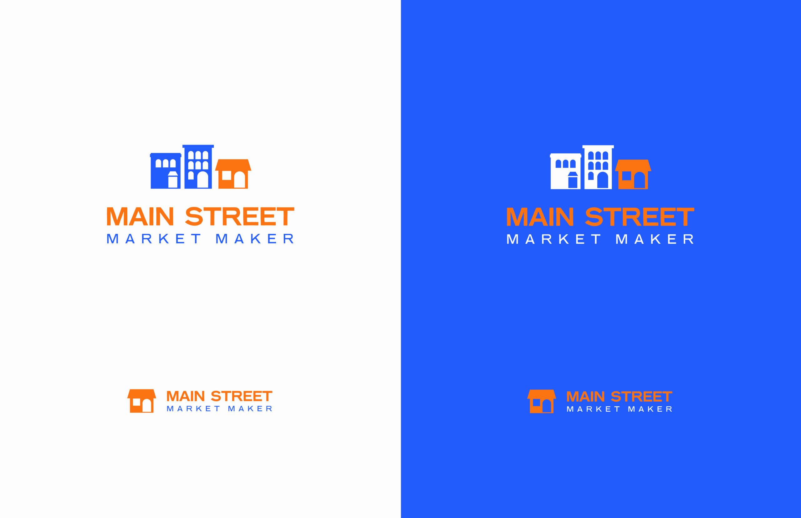
Examples of the Main Street Market Maker logo in use.
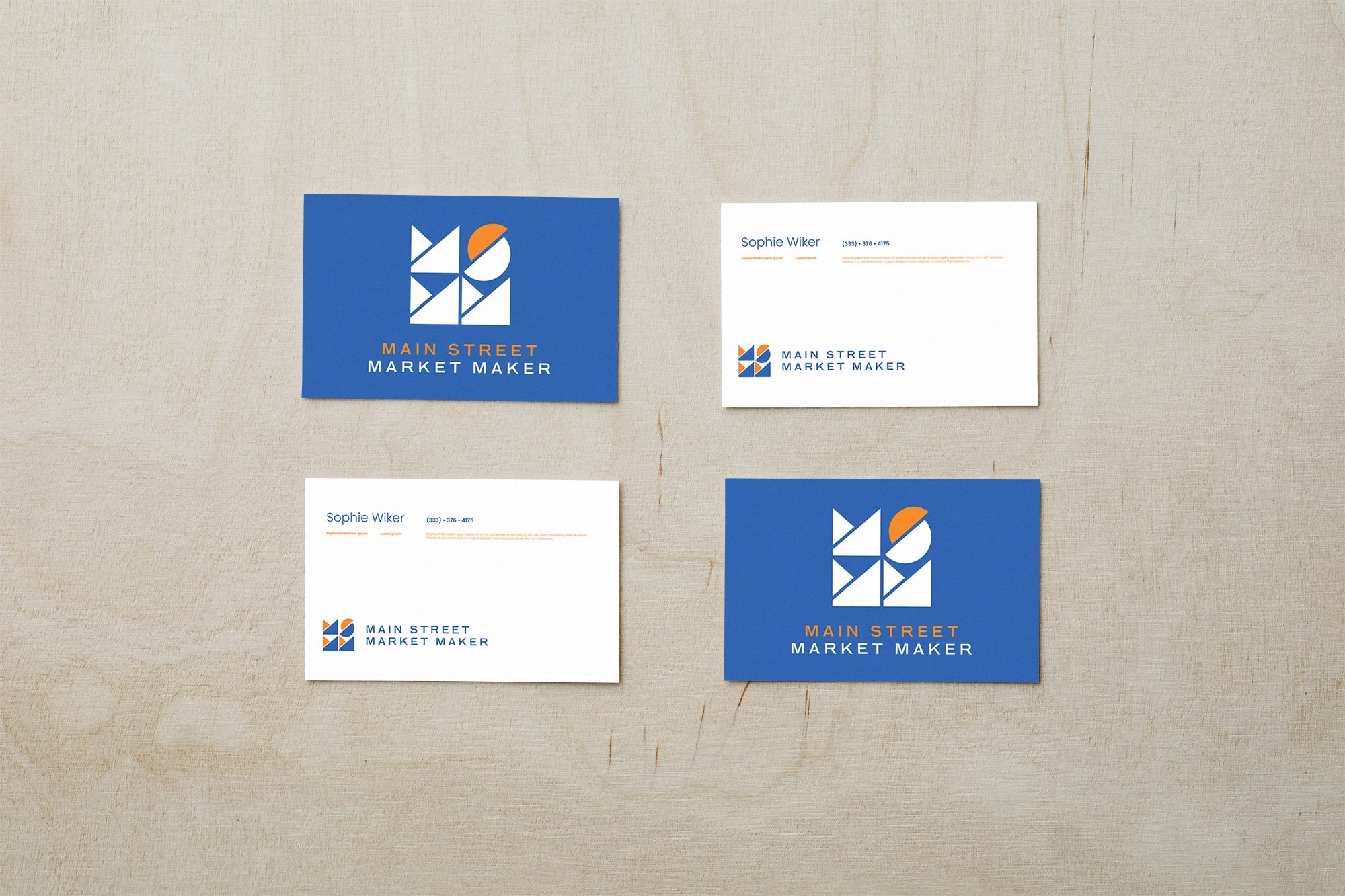
Mockups of the Main Street Market Maker Logo.
Where does a logo designer start?
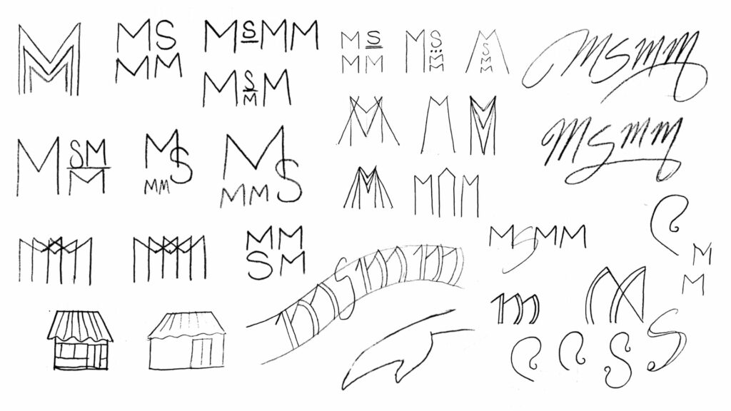
Nora began her creative process with brainstorming and hand sketching. She explored imagery associated with small businesses, such as icons of boutique buildings, but also branched into more abstract ideas as well. The concept of two hands coming together for an exchange seemed to fit the personal, neighborly connotation Main Street Market Makers was striving for.
She then turned her attention to type exploration. What fonts and layouts suggest small town America? What flavor of type exists on main street banners, signs, and awnings? Nora ventured into curved type, cursive, and art deco influences to answer these questions.
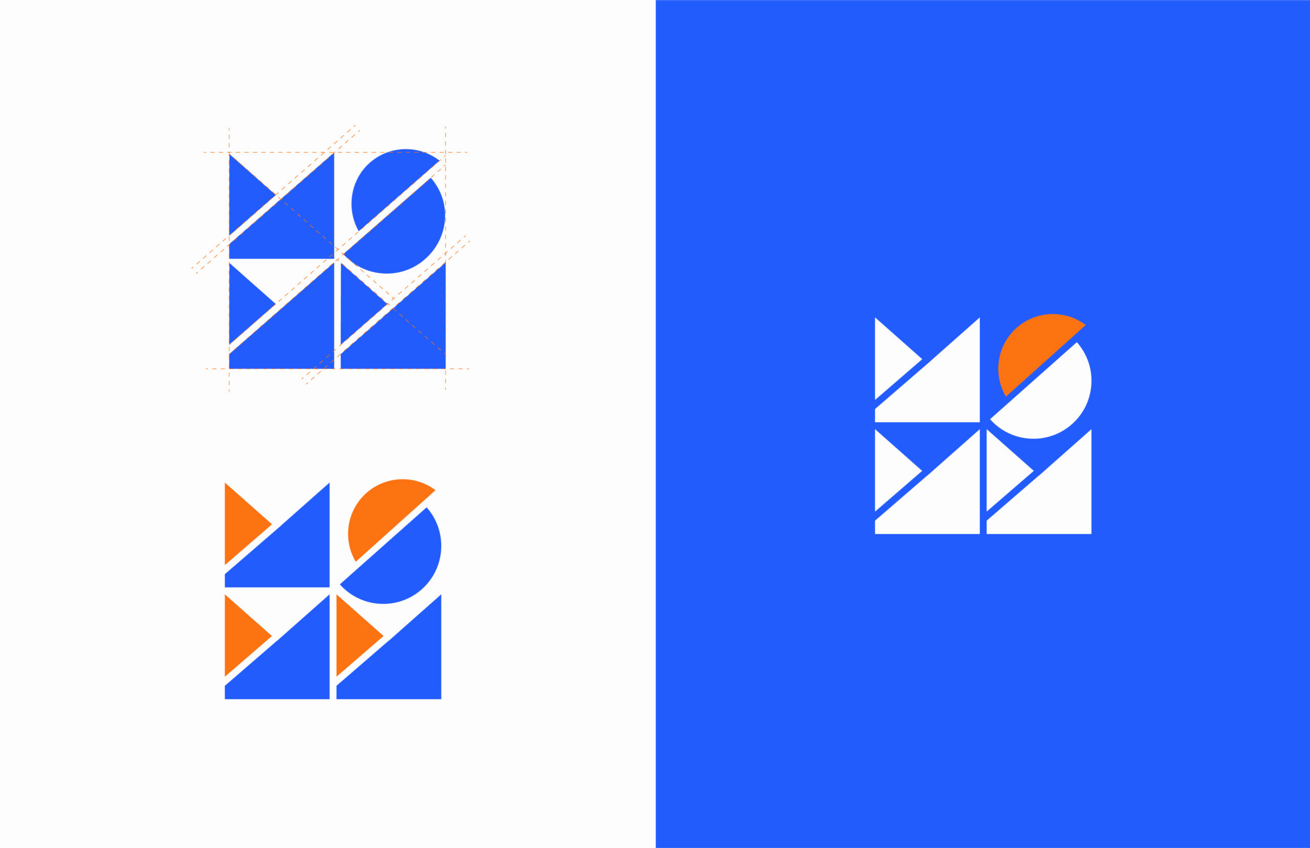
She also found interesting dynamics at play with the Main Street Market Maker’s acronym: MSMM. The sharp angles and vertical symmetry found in the three M’s contrasted with the soft point symmetry of the S. Nora first played with emphasizing these differences before then attempting to unify them. She was asking the question ‘can I make M and S feel like they exist within the same system?’
What comes after the initial sketches?
After the initial hand sketching, Nora took the strongest ideas and refined them as vector forms. The client was excited about the blue-orange color combo, so she stayed within that color scheme.
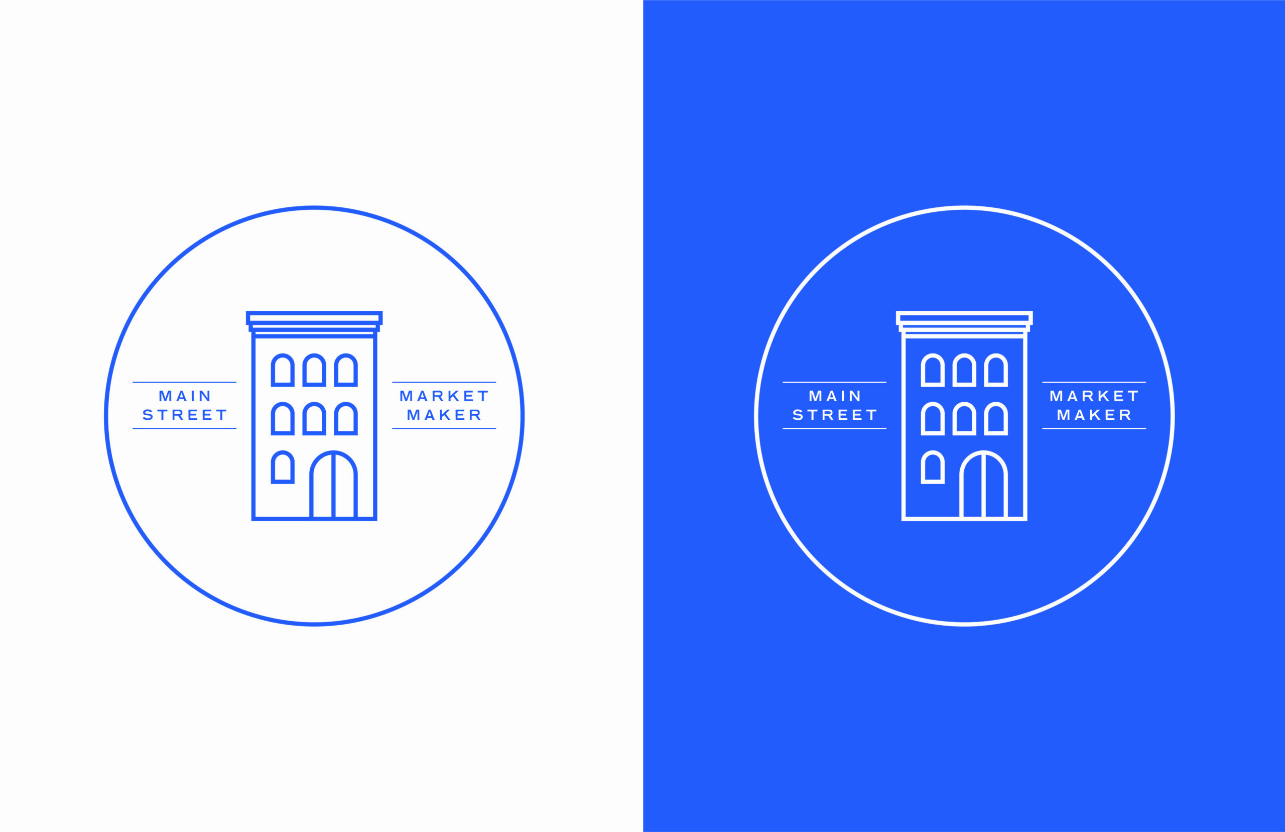
After creating these digital designs, Nora revisited her hand sketches for a final look. There was one quick acronym sketch that captured a blocky symmetry that intrigued her. She attempted a design in which ‘MSMM’ existed within a perfect square. She opted for simplified, blocky forms to suggest the slanted roofs and cube-like blueprints of small-town-American buildings.
Though the final design appears congruent and simple, for a professional logo designer, finding the exact angle and dimensions for each of the elements to fit within a perfect square can be painstaking, similar to solving a complex puzzle. The final angle used throughout the design is approximately 42.135 degrees. It can also be noted that the curves of the ‘S’ both rise and fall further than its designated baseline and cap-height to create optical balance.
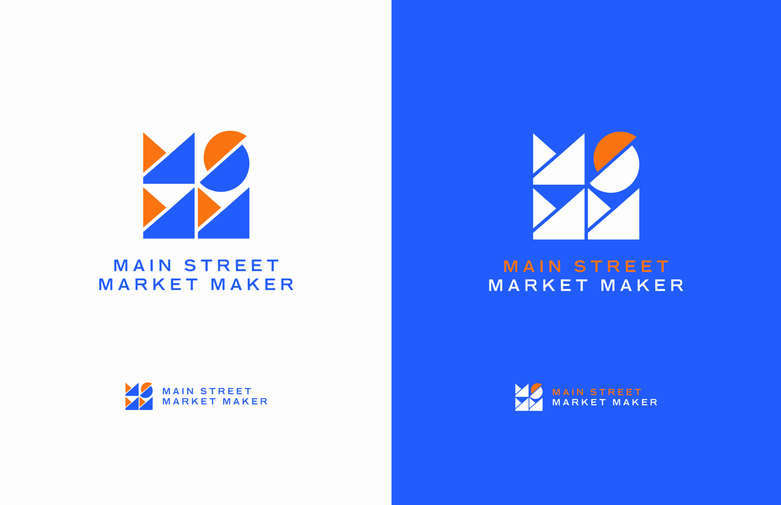
Nora then complemented the acronym icon with a wordmark and created a vertical and horizontal format for the final logo.
In the last stage of brand design, Nora created a simple animation emphasizing the blueprint-like symmetry of the final logo.
To take advantage of the expertise of a digital marketing agency and get started on the road to success, contact us here and we’ll be in touch right away!
A recent graduate from the WMU Frostic School of Art, Nora is passionate about design, photography and storytelling. She loves traveling with her family, exploring new cities, hiking and kayaking Lake Michigan. She also works and travels with Compassionate Hope Ministries located in Southeast Asia.